Sunday 20 December 2015

Binary Opposition

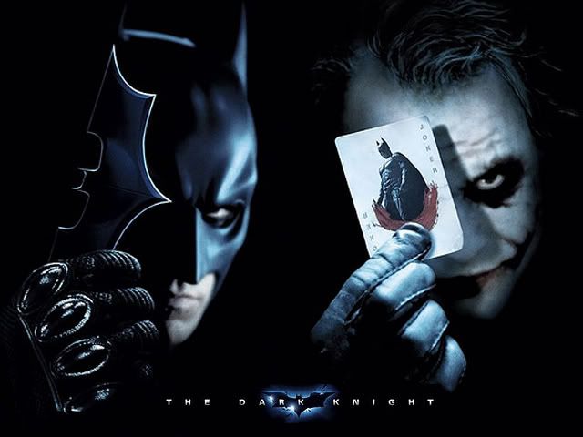
Binary Opposition is the theory of Levi Strauss. He believed that the way we understood certain words wasn't because of their actual meaning exactly, but much more by our understanding of the difference the word and its 'opposite' or as he called it - 'binary opposites'

Binary Opposition is commonly used in films and some examples are:

- Good vs Evil
- Young vs Old
- Male vs Female
- High Class vs Lower Class
- Rich vs Poor
- Pretty vs Ugly
- Black vs White
- Man vs Nature


Friday 11 December 2015

My Album Cover

Here is my album cover that I have created for the 'Lord NB' character that will feature on the front cover of my magazine and possibly the contents page too. On the front cover of the album is an image of the character and I have added an effect to the image to make it have shadows of some sort. This all links to the name of the album 'IN THE SHADOWS'. I chose the name because it represents how my character was seen as a nobody and then all of sudden became an iconic rapper. He was in the shadows and is finally being known for his music. The dollar bill on the album is stereotypical for rappers to do, as money associates with rappers a lot these days. I have used it so it looks like the iconic 'gangster' thing to do and will hopefully appeal to the target audience. The colour of the album is red because it denotes danger, and that's what a lot of rappers personality's are like. I have also included the parental advisory logo again to show the type of music my character produces and that it is explicit. The album will have a small feature on my magazine on the contents page or the front cover and can hopefully be used as a selling point.

More photoshoot plans

Here are some extra photo-shoot plans I have made before the real thing actually happens. I have decided to change locations because I think it would be more suitable for my character and the genre of the magazine I'm producing

Album Cover Photoshoot

Here are some photos that I took for the front cover of my album that will feature on my magazine. I will use one of these photos for the album cover and then post what the final album cover will look like in an upcoming post.

Monday 7 December 2015

Album Cover for Double Page Spread

Here I have created an album cover for the character featuring on my double page spread, King Hale. I have called the album 'Throne' because it links to the personality of my character, he wants to be looked up to by his fans and appeal to a wide audience. The image used links to the title because he is striking a worshipping pose of some sort which gives the impression he has power. Behind the image is a skyline of LA which is where my character is from. The crown at the top links to the title of the album and the image, because it gives the impression the character is a king of some sort which also links to his name 'King Hale'. The imagery and words I have used have synergy and make sense to who the character is. I have also included the parental advisory logo to show the genre of the music. The album cover will feature on the double page spread of my magazine.

Friday 4 December 2015

Contents Page Draft

I have also created a contents page draft. Again these are just a few ideas that I have had and I'm sure the final product will look quite different.

Front Cover Draft

Here is a front cover draft that I have made for a practice attempt. These are just a few ideas that I have had and the final product will have changes like the main image.

Final Masthead

Here is my design for a masthead for my rap magazine Explicit. I have decided to use a gold/yellow for the font because a lot of rappers tend to wear gold as it is considered cool and is a part of the gangster look. This all links in to the genre of my magazine and will hopefully appeal to the target audience as being a rap magazine. I have decided to use red behind the main masthead because it represents danger, which links to the personality of many rappers. My background on my magazine will be black as it doesn't contrast with the colours used on my masthead.

Thursday 3 December 2015

Font Change

I have decided to make a change to the actual magazine production and have decided to use a different font to the one I set out to use. I found this font and asked my target audience about it and the results concluded that they liked this one more than the previous one I chose. I also like this font more and I still think it fits in to the genre of my magazine with the graffiti like style to it. 

Wednesday 2 December 2015

Possible props for magazine

Here are some ideas for some props that I might use for my photo-shoot. I think some of these props are important because it will symbolize my character and represent the genre of the magazine.

Practice shots for double page spread character

Here are some practice shots that I took for my character that is going to be featured on my double page spread, King Hale. These are just some practice attempts and I will plan more when it comes to the real thing. These practice shots are how I want it to look however, but with my character wearing a different outfit and a different location for the pictures.